Project Showcase: a bold & modern visual identity and website for an LA-based therapy practice
Part one: Branding
When creating the brand identity for East Side Therapy, the goal was to develop a visual language that reflects the practice's ethos: offering a calm, grounded, and approachable space for healing. East Side Therapy,Every design decision was carefully crafted to resonate with the practice's audience while maintaining a professional yet inviting tone. Here’s an inside look at how this brand came to life:
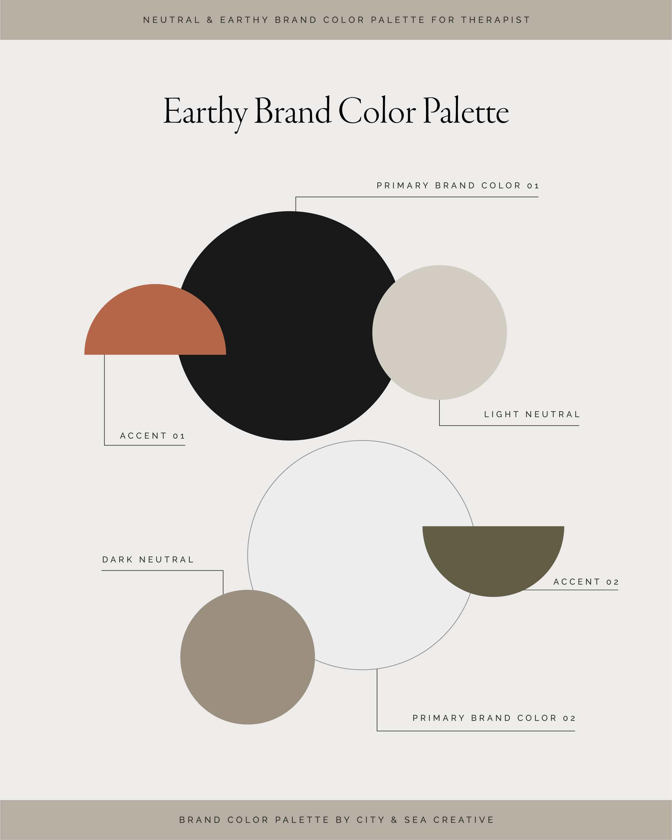
East Side TherapyColor Palette: Grounded in Nature
The color palette plays a central role in conveying East Side Therapy’s personality. We selected a neutral and earthy range of tones, including olive green, taupe, and slate, complemented by warm accents like tangerine. Here’s why:
Olive Green: Symbolizes growth, balance, and renewal—core elements of the therapy journey.
Taupe and Burlap: Offer a sense of stability and neutrality, grounding the brand in calmness.
Tangerine Accent: Adds a subtle warmth, representing hope and connection.
Slate and Light Neutrals: Provide depth and contrast, ensuring the brand feels modern and professional.
This palette creates a safe, nurturing visual environment for potential clients while standing out as modern and timeless.
Typography: Clean & Refined
The typography balances elegance with accessibility. The logo uses a contemporary sans-serif font for “East Side,” creating a clean and open aesthetic. For “Therapy” and “Los Angeles,” a subtle shift in weight and spacing adds sophistication without overcomplicating the design.
The choice of typography reflects the practice's commitment to clarity, trustworthiness, and professionalism, all while remaining approachable.
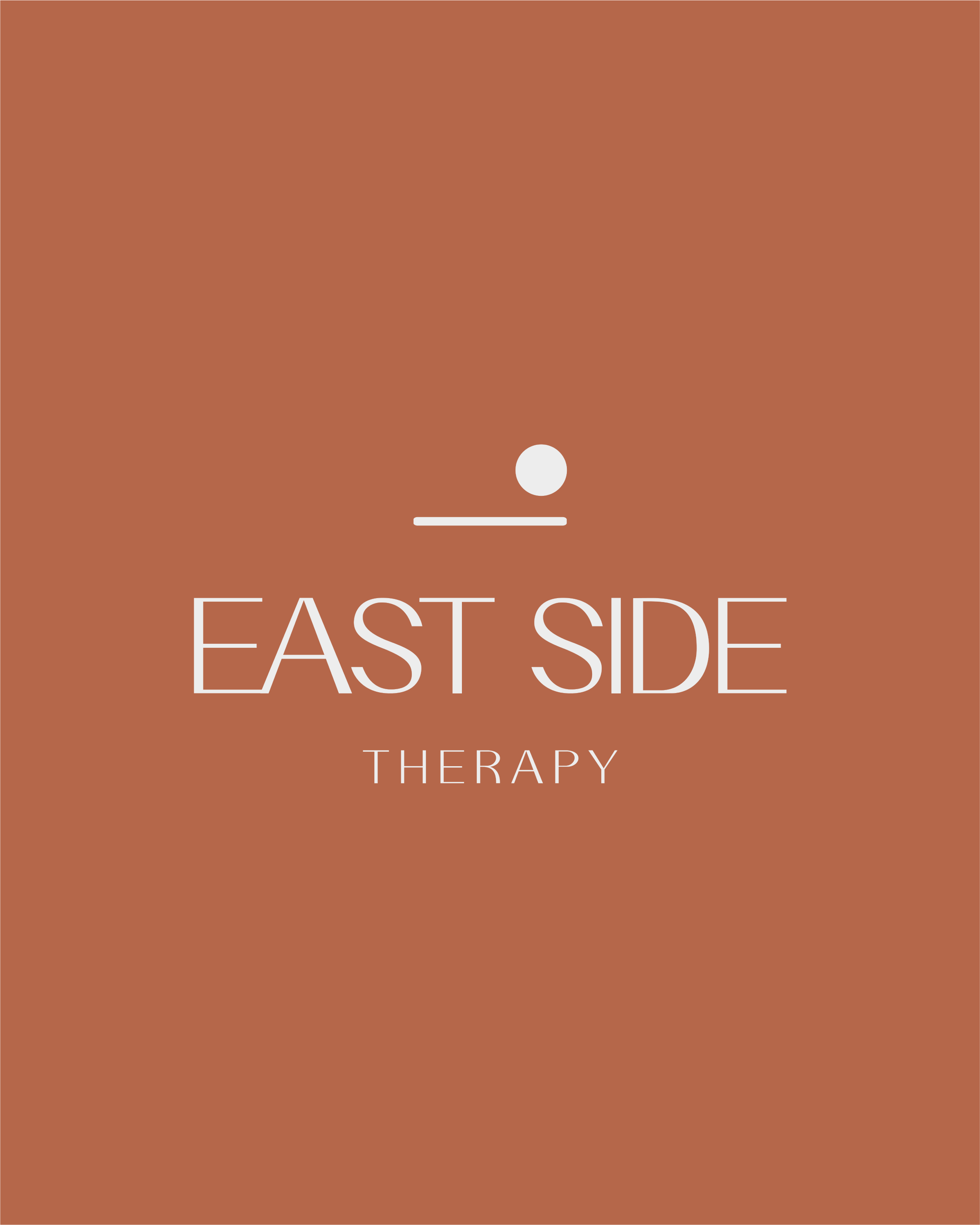
Logo: A Minimalist Approach
The logo design emphasizes simplicity and symbolism:
Abstract Horizon Line and Circle: These minimal elements evoke a rising sun, symbolizing hope, new beginnings, and the journey toward healing.
Balanced Composition: The elements are intentionally aligned to convey stability and calm, mirroring the therapeutic process.
By stripping the design down to its essentials, the logo speaks to the clarity and grounding that therapy offers.
Layout: Organized and Spacious
The brand’s layout approach mirrors its values of creating a safe, structured, and welcoming environment:
White Space: A generous use of white space provides room to breathe, evoking calm and clarity.
Geometric Balance: The use of circles and horizontal lines reinforces balance and connection, symbolic of the therapy process.
User-Centered Design: Every aspect, from logo placement to color harmony, is designed with the audience’s sense of comfort in mind.
Why This Works for a Therapy Brand
East Side Therapy’s identity stands out because it creates an emotional connection. The visual elements work together to:
Foster Trust: The neutral tones and clean typography create a professional yet relatable presence.
Convey Warmth: Warm accents and organic shapes ensure the brand feels inviting and human.
Represent Growth: Subtle natural elements, like olive green, embody the transformative process of therapy.
This design offers a therapeutic experience in itself—a soothing and cohesive aesthetic that echoes the supportive environment East Side Therapy provides.
Part Two: Website Design
Designing a Calming and Client-Centered Website for East Side Therapy
After establishing East Side Therapy’s brand identity, we translated those same principles of warmth, trust, and approachability into the design of their website. The site was built to be more than just an online presence—it serves as a virtual extension of the therapy practice, offering potential clients a welcoming and seamless experience. Here’s how we brought the brand to life online:
Homepage: First Impressions Matter
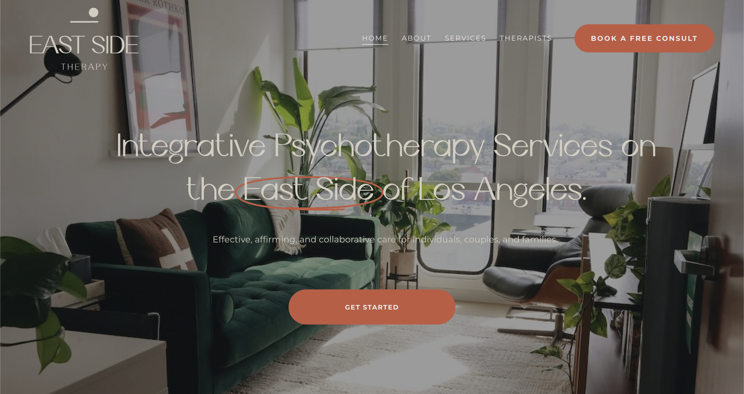
The homepage was designed to immediately set the tone for East Side Therapy. Visitors are greeted with a calming hero section featuring the logo and a motivational tagline such as, “Finding Balance Starts Here.” A softly blurred background image of nature—like a sunrise over a calm landscape—ties in the brand’s earthy color palette and reinforces a sense of peace and renewal.
Key features include:
Clear Navigation: A simple, clean menu ensures users can easily find the information they need without feeling overwhelmed.
Prominent Call-to-Actions (CTAs): Buttons like “Schedule a Consultation” or “Learn About Our Services” are thoughtfully placed throughout the page to guide visitors toward the next step.
User Experience: Focused on Comfort
The overall user experience was carefully considered to ensure every interaction on the website feels intuitive and calming:
White Space and Typography: Generous white space paired with the brand’s clean, modern typography creates an open, breathable design.
Mobile Responsiveness: The site is optimized for mobile devices, ensuring accessibility for clients on the go.
Soft Animation: Subtle hover effects and smooth transitions add a sense of flow without being distracting.
A Digital Reflection of East Side Therapy’s Values
The final website design for East Side Therapy aligns perfectly with the brand’s mission of creating a safe and nurturing environment. From the serene color palette to the seamless navigation, every design decision was made with the client experience in mind. The website doesn’t just inform visitors about the practice—it welcomes them into a space of calm, trust, and hope.
If you’re a therapist or wellness professional looking to build a website that truly reflects your values and connects with your audience, the East Side Therapy project is a perfect example of how intentional design can transform your online presence into a powerful tool for growth. Inquire here to become a client today.


